
Clensta, a Gurgaon start-up refreshes its brand appeal with a new logo
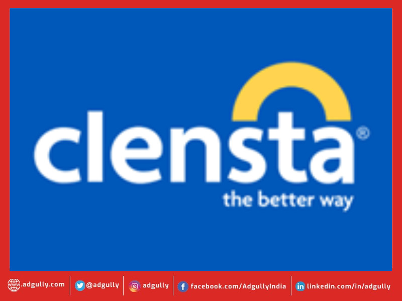
Clensta, a Gurgaon-based new-age start-up, has introduced a new logo and brand identity with an intent to enhance consumer connect. Long operating in the space of creating innovative, market-first products, Clensta has been best known for developing waterless technology backed bathing solutions. However, they have now leveraged on their innovation capabilities to fully enter the consumer space with diverse offerings in categories such as skincare, haircare, wellness, home care and others. The Caspian backed start-up believes this allows it to chase a much larger TAM (total addressable market). With this in mind, it was necessary for them to refresh their brand and overall identity.
The arc in the new logo design depicts progress; moving forward from one point to the other. This fits in with their new tagline: “The Better Way”. It also reflects Clensta’s ambition of being an umbrella brand which straddles multiple categories. The colours, blue and yellow, stand for trust and progress, respectively. Thus, this new design reflects the brand narrative and promise of Clensta.
As a purpose driven brand, Clensta wishes to deviate from tradition and carve its own way instead of following the usual route. Empowered by a strong emphasis on research and innovation, Clensta seeks to be a value generator by offering distinctive proposals to address unresolved problems. It aspires to tap into newer audiences and expand its TG by presenting before customers a wider array of choices. Choices which lead to better care and outcomes for the consumer, as well as an improvement in the environment. All of these ideas are encapsulated in the brand pillars for Clensta – integrating nature & technology, sustainability and thoughtfulness.
In addition to the logo, Clensta has developed a new illustration which encapsulates its brand promise and will be a driving force for them going forward. They wish to make a better world for consumers, where all their needs are taken care of, including the needs of their children, their homes and even their pets. The flowing water represents the waves of change Clensta wants to bring, the sun represents positivity and progress. There is also a depiction of the tree of life, a powerful motif of sustainable progress, representing that the fates of man and of nature are intertwined.
Commenting on the development, Puneet Gupta, CEO and Founder, Clensta said: “Our new logo and brand identity are in line with our core values. Our purpose as a brand is to ensure steadfast commitment to seeking the better way of providing value through innovation and the changes to our logo and brand appeal collectively represent our vision and what we stand for as an organisation. The change not only showcases what the company has envisaged as a brand but also gives one a window into the endless array of future possibilities and potential that we have before us. With this in place, we believe we are better positioned to chase our vision of touching 5 crore households in 5 years”.


Share
Facebook
YouTube
Tweet
Twitter
LinkedIn