demitsu revamps its brand Identity with new Logo
Idemitsu, one of the leading manufacturers and suppliers of high-performance lubricants In Indian Automotive & Industrial segment, unveils its new corporate brand identity.
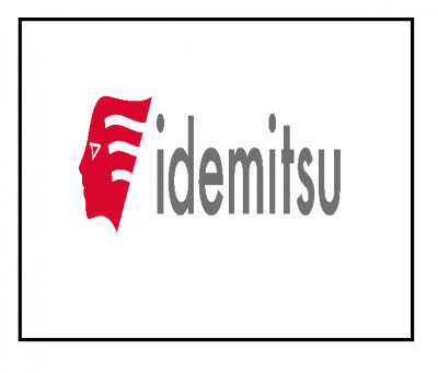
The new identity reflects a more edgy and contemporary appearance while enhancing the brand spirit. It resembles Apollo, the Greek & Roman God of Sun, that symbolises with humanity, energy, aspiration and foresees the future. It reflects brand’s flexibility in adapting to constant changes in the society. The image is well suited and represents the Idemitsu Group's philosophy, mission and vision based on the importance of people working for them.
The new identity corporate colors are traditional red (emotional red) and calligraphy ink (cool grey) that shows pride in its Japanese origin. The color
combination is not just a mark, but the ideal representation of what Idemitsu stands for. The idemitsu logotype incorporates an easily readable font that
expresses a sense of warmth and expression .The branding conveys the design more in line with the aesthetics and portrays environment friendly and flexibility.
Mr. Yoshitaka Shiraga, Deputy Managing Director of Idemitsu lube India, speaking on the development, said, "We are proud to announce our new brand identity that communicates our vision, mission and ideologies. Apart from a product core company enabling trust to our customers and Partners, Idemitsu constantly works towards providing value-added solutions. We have emphasized our forward-thinking mind-set and objective to achieve strong growth, drive innovation and focus on sustainability across all markets.


Share
Facebook
YouTube
Tweet
Twitter
LinkedIn