Essence refreshes its brand for new brand experience
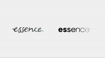
Essence has refresh their brand with the help of Design Studio, Ueno. The new logo and website are meant to reflect the modrdern brand experience.
In a blog on their website, they speak about the creative thought process that went behind the conception of the new brand identity.
Over the last 9 months, Essence teamed up with the design studio Ueno to translate the things that make us special into a modern brand experience that more clearly communicates our leadership role in the industry.
Our updated design system unites a modernized wordmark, new fonts, and a bold color palette in an updated essenceglobal.com, designed to make our perspective, expertise, and capabilities easy to understand for everyone from expert practitioners to people who are simply interested in the evolving role of data in the rapidly changing marketing industry.
Here’s a look at some of the thinking that went into designing our new brand experience:
The wordmark
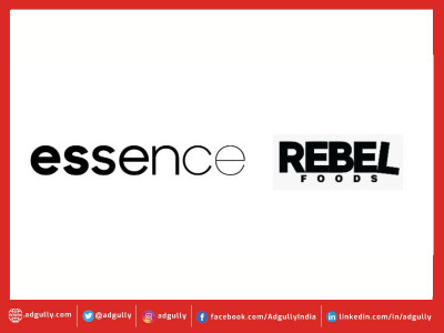
Our new logo is a relatively simple evolution from previous Essence wordmarks. It’s still a lowercase presentation of “essence,” but utilizes descending font weights to convey the meaning in our name; specifically our ability to help clients get to the simplest, most efficient - and most effective - articulation of an idea.
Colors and Fonts
Our new style guide utilizes five colors, with a new primary brand color: International Orange, a unique mix of both red and orange. Originating out of the aerospace industry, International Orange was developed to set objects apart from their surroundings. For Essence, it distinguishes us in the marketplace while conveying the energy, positivity, and optimism we’re known for into our website, social channels, and our work around the world.
When it came to selecting fonts to bring our new brand experience to life, we wanted to balance our data-centric business with an editorially-led verbal identity with a more conversational tone. Our style guide pairs the robust serif Cambon (from General Type Studio) with the rational and clear Sharp Sans (by Sharp Type Foundry). Both fonts are strong independently and even better together.
The new essenceglobal.com
Our new site is a platform that celebrates our mission and elevates the unique combination of creativity, technology, and people that differentiates us. Designed with four principles in mind, the site seeks to create clarity out of complexity for users, convey Essence’s disruptive influence in the industry, evoke the balance between ideas and data at the heart of everything we do, and represent our willingness to constantly learn and improve. Functionally, the site’s design ensures our services are clearly articulated and the perspectives, news, and people that demonstrate what makes Essence special are easy to find.
Like Essence, the site and our brand will continue to evolve based on feedback, analytics, and our desire to continue driving change in our industry in order to create a sustainable future for advertising.












Share
Facebook
YouTube
Tweet
Twitter
LinkedIn