
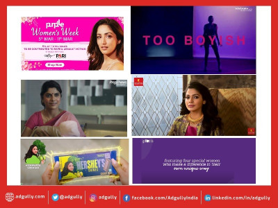
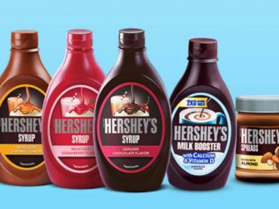
Hersheys collaborates with WOW Design for its product launch

WOW Design, a strategic brand design consultancy has associated with Hersheys for strategizing the packaging design for its newly launched range of healthy flavored milkshakes.
Evolving Indian consumers prefer richer, superior experiences when it comes to food and beverages as they are exposed to it on global excursions. The health foods category in India too is slowly evolving to meet with the consumers preferences. Various products ranging from flavored milkshakes to yogurts have hit the market already. Being well-aware of increasing consumer demands, HERSHEY’S decided to launch its range of healthy flavored milkshakes. With apt understanding and expertise in packaging design, WOW Design stepped onboard with Hershey’s for the product launch.
Creating elegant and Impactful packaging
WOW Design is a strong believer in creating elegant and impactful packaging, as it’s the face of any brand and allows an interaction of only a few minutes with the consumers before they make up their mind.
For HERSHEY’S product launch, WOW Design evaluated both - the current brand drivers and the challenges in launching a product that would appeal to both the buyer (mothers) and the consumer (Kids). These drivers were - existing equity with the consumers in delivering rich experience on taste, flavor and mouth feel and an aspirational imagery attached to the brand. The challenge was to find a fine balance between delight for kids and healthy goodness for mothers in a pack of milkshake while exhibited on the same shelf as its Indian competitors.
Design Ideation
A thoughtful decision was taken to leverage on the richness and consistency of the product to establish it as a milkshake versus the available flavored milk products. The designs stemmed from the core concept of it being the ultimate healthy milkshake that kids deserve. This was effectively communicated through a bold double splash. The upper splash subtly depicted a crown like structure to establish the premium feel attached with the brand. That the product is fortified with calcium and vitamins to make it a good healthy choice for the Kids was highlighted on the front of the pack, making it clearly visible and not to be missed by mothers.
The final result was clean, yet communicative range of packs that retained the global appeal of the brand HERSHEY’S and connected effectively with the health-conscious Indian consumers.
Ms Deepti Kshirsagar, Partner and Executive director- WOW Design said, “When it comes to think of a product like packaged milkshakes and is targeted primarily to the kids, the design strategy needs to work for the dual Target Audience- one the consumer and second the decision maker. Coming from an aspirational yet familiar International brand like Hershey's, the trust aspect for the mothers and tastefulness for the kids could be taken care of with a prominent brand endorsement in the design. The challenge was to imbibe the healthy goodness of the product, as that becomes a primary concern for the mothers and impact decision making to a large extent. We have managed to create a Pack design that talks clearly of the fortification to the mothers, leaving no doubt when it comes to picking it up from the shelves”. Mr Saswata Das, Partner and Executive Director- WOW Design said, “The rapid growth of the flavored milk beverages category in India has attracted many global players like Danone and even Coca-Cola to enter this segment. Hershey’s approached us as it also intended to enter this growing segment to complement their existing premium portfolio range. We helped Hersheys’s to take on the Indian players and charge a premium for their unique positioning and fortification benefit.”

Share
Facebook
YouTube
Tweet
Twitter
LinkedIn