Mahindra dons a new brand identity!
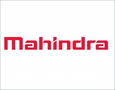
The Mahindra & Mahindra group, the $ 16 billion automotive to information technology to financial services major has unveiled a new global brand identity that depicts one Mahindra to the world. The new brand architecture is a new Mahindra wordmark in a fresh logo style and in a vibrant red colour.
Speaking to Adgully, S P Shukla. President Group Strategy and Chief Brand Officer, Mahindra Group said, “this is a part of our Rs 120 crores brand repositioning mission that began in 2011 with a campaign called Rise. The group has transformed over the years. From just being Indian to one with global aspirations today. We have to be able to reflect that change - it's internal, it comes from product diversification and our Indian and international aspirations. The new word mark is accompanied by a new graphic device called the 'ridge', which conveys a global presence in over 100 countries. The fresh new visual identity will be reflected across all its businesses globally.”
So what changes in the new visual identity?
Says Shukla, “The Mahindra logo now sports a new, hand drawn word mark which builds on the Group’s heritage while infusing modernity and dynamism into the brand. It is a lot more contemporary, edgy and sleek and visually represents the changes the business is making to embrace and shape the future. It will also be depicted in the new ‘energetic red’ colour, a deeper shade of the signature Mahindra red which is the primary colour connected with the brand.
A unique graphic element or ‘Ridge’ completes the new visual identity and will provide a uniform look to all communication and print collateral across the Group. Inspired by Mount Everest’s ridges which lead to its summit, the Ridge is an integral element of the visual identity and symbolises the pathway to achieving one’s potential and aspirations. As a graphic device, it ensures that our communication is united and easily identifiable. Moreover, it signals Rise and Mahindra’s role as an enabler.
“The group will use various colour combinations will be used to distinguish between the various businesses of the Group in order to create a sense of family identity for all Group companies, while ensuring that each business has an identity of its own,” says Shukla. While corporate and mobility businesses will be all red, B2B businesses will be red-grey and B2C businesses will have different colour combinations.
The new word mark and other elements of visual identity have been adopted after extensive research and feedback. The group wanted a word mark which would reflect the evolving nature of the organisation, its global outlook and progressive management style. “In short, it should reflect the ‘core’ of Mahindra. We also had to ensure that it would have universal appeal across consumer and business segments in urban and rural areas, as well as overseas. We have tried to create a modern futuristic feel, while retaining the dependability, reliability and warmth associated with the Mahindra brand,” concluded Shukla.










Share
Facebook
YouTube
Tweet
Twitter
LinkedIn