Medvarsity adopts an evolved brand identity through visual rebranding
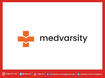
Medvarsity Online, a healthcare edtech platform adopts a new brand identity with the launch of its new logo. The visual rebranding endeavor retains the earlier elements of the logo viz. the medical cross and the open book, symbolizing the synergy between knowledge and healthcare. However, the new logo is sharper, impactful and has better recall value with deeper and warmer colours and stronger font. It is in line with the new brand vision - ‘knowledge changes lives’.
With this, Medvarsity aims to connect with its audience on a deeper level by bringing about the promise of reliability and commitment. The brand refresh is just the first step towards a long road of expedited growth and opportunities.
Gerald Jaideep, CEO Medvarsity said, “Ever since its inception, Medvarsity has been consistent and focused on providing quality healthcare education. Built on a strong foundation, over the years, Medvarsity has maintained its growth trajectory. However, as we move towards our next phase of growth, we’re optimizing both our processes and our disposition. To that end, we’re refreshing our brand identity and driving ethos as we accelerate into the future.”
With years of providing the best healthcare programs to medical professionals, Medvarsity has achieved 10X growth over the last few years. With the unveiling of the new look across platforms, Medvarsity intends to achieve top of mind recall when it comes to aspirants in the healthcare sector.










Share
Facebook
YouTube
Tweet
Twitter
LinkedIn