Rubans undergoes a logo change !
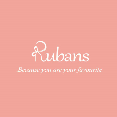
Rubans recently revealed their new brand logo and identity as part of the ongoing evolution of their company’s vision. Over the years it has grown exponentially and now Rubans caters to more than 1 million happy customers. The new refreshed logo reflects on how Rubans has evolved over a period of time and it also symbolizes it’s future.
What started as a dream - with a bootstrapped capital of Rs 3 lakh from a 36 sqft Kiosk in Phoenix Mall, Bengaluru, 7 years later Rubans has become a national brand and is growing by more than 100% Year on year.
Rubans’ new logo has been conceived and designed internally and signifies a free flowing ribbon, which reflects a modern approach towards jewellery and captures Rubans’ mission to deliver excellent quality, performance and service support across the products they provide and has no boundaries. For this new logo, Rubans’ chose the colour peach to reflect the expression of modesty, earnestness and innocence. The colour peach brings a high degree of positivity, always rejuvenating us, even in the most difficult moments.
Adds Chinu Kala, Founder of Rubans, who has also designed this logo – “Rubans in French means a Ribbon. Wrapping a gift with a Ribbon is so much more than ensuring the element of surprise for the recipient. A gift wrapped with ribbon adds a beautiful personal touch to the art of gift-giving—one that tells a dear friend or a loved one that you have put your heart into every step of the process. It’s with this sentiment that I launched Rubans –a brand that describes who I am and what I create. Being able to relate to my customer, their lives and their style on a personal level is the ultimate goal for my jewellery brand, it’s like a ribbon which ties their gift of life together”
Rubans - Because you are your favourite







Share
Facebook
YouTube
Tweet
Twitter
LinkedIn