Shemaroo Entertainment beefs up its desi connect with brand refresh
While reflective of the evolving nature of the business, the company’s new logo looks to maintain the brand’s core entertainment ethos
For Shemaroo Entertainment Ltd (Shemaroo), a simple logo change exercise that began 10 months ago eventually morphed into a full-blown brand refresh.
The 55-year-old company has come a long way since inception, when it began life as a video library started by Pudichand Maru. Half a century later, under the care of his successors, Maru’s legacy has become India’s largest owner, aggregator and distributor of film entertainment content. During this period, however, the typography remained the same and, therefore, there was a crying need felt within the company for a change.
When the winds of technological disruption blow, the most deeply rooted organisations face the threat of becoming irrelevant as they become resistant to change. Shemaroo’s involvement, over the last decade, in the digital space has accelerated along with an attendant internal shift in its business strategy.
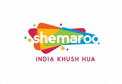
On Tuesday, amid the fanfare of beating drums and theatrical smoke, Shemaroo announced its new brand identity ushering in a new chapter in its journey. Despite a varied content mix of devotional, music, kids, film, regional and Hindi entertainment, according to a perception survey conducted by the company, the management found that brand Shemaroo still evoked memories of classic films and Bollywood songs. In a bid to break the narrow confines of this perception, the management decided to undertake a brand refresh so as to reflect the contemporary nature of its business while not eschewing its image as a destination for Indian entertainment.
“The logo comprises a series of overlapping layers in rich Indian colours standing for Shemaroo’s promise of offering an imaginative range of zesty Indian content to a diverse group of consumers,” the release issued by the company stated. The company also announced ‘India Khush Hua’ as its new tagline, “an emotion that emphatically states the joy we bring in people’s life with our multi-genre offering.”
Speaking to a media roundtable, Shemaroo CEO Hiren Gada said, “After several changes that we made internally in our business strategy, we began to look outward and asked ourselves whether the perception of the world towards Shemaroo had changed.” Following this epiphany, the company reached out to Ogilvy India to facilitate the transformation in the brand identity.
“We started this journey by conducting brand audits that included interviewing stakeholders inside Shemaroo as well as a bunch of consumers. Our investigation revealed that there was this recurring theme of Indian-ness that came up in our talks. There was something deeply Indian about the brand and we wanted to identify what that was,” Ogilvy India CEO Kunal Jeswani remarked. From pretty much the get-go, the Ogilvy team thought it prudent
to imbue the unabashedly desi connect into the brand’s visual identity.
Embodying that vision was among the chief briefs for the creative folks at Ogilvy. Added Gada: “A personal takeaway I got from this is the burst of energy, an energy that only Indian entertainment can bring to its audience. This energy will propel us in the coming period of accelerated growth in the Indian market, where we anticipate growth of 5x in the next five years. This logo fits right in with the ambition that we have taken on.”
The identity will be unveiled across all Shemaroo assets, including the digital medium wherein Shemaroo garners over 600 million views a month. A phased campaign to target consumer and trade touch points will be rolled out soon.
Explaining the rationale behind the choice of the new font for the logo, Jeswani said, “When you select a new design, your primary concern from a design-typeface perspective is to give it longevity. This one is more from the point of view of future facing, something that looks dynamic, looks modern, and really fits into any environment. You will see it across television, web, mobile and other platforms. Hence, the font needs to be clear and visible even on small screens.” Gada added that the font embodied an informal relationship with the consumer due to the absence of capital letters.
“Anytime any brand goes through an identity change, there is obviously a perceptual link to it,” Jeswani pointed out. In this case, the perception was that the country knew the brand through a fairly narrow lens. “Shemaroo is far more embedded into future platforms than consumers realise. The trick is to create a new identity that reflects that and puts that out there,” he said. The challenge for Jeswani was to maintain the brand’s core ethos—entertainment.
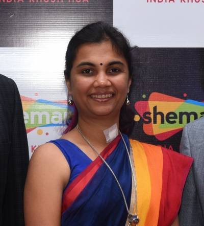
For Shemaroo COO Kranti Gada, the key takeaway in the new logo was the tagline ‘India Khush Hua’. “We want to be the custodians of Indian entertainment, understand the Indian consumer, their dichotomy and cater to it. In every genre of content that we add to our platform, we want to keep the consumer at the center and truly bring alive ‘India Khush Hua’.” While staying true to it core target group, she, however, said that Indian content was not the company’s only niche as the company looked to build on its large base of users.
The cluttered Indian marketplace has witnessed yet another attempt to break away from the plethora of entertainment brands out there but the difference this time is that brand Shemaroo already has a strong niche to build on. For Hiren Gada, the nostalgia and the joy of simple times evoked by the brand for the Indian consumer remains critical. Only time will tell whether the refresh manages to meet its objectives but, so far, signs look pretty good for Gada and company.
Earlier this year, the company’s board of directors ushered in a ring management changes with the appointment of Hiren Gada as the CEO of the entity while Kranti Gada was named COO.











Share
Facebook
YouTube
Tweet
Twitter
LinkedIn