
Taproot KIK(s) up LANKAN TO THE LAST DROP

The entire communication of the cola major was fragmented into 8 mini groups- cricket, beach, bowling, music, partying, shopping, gyming and schooling.The launch commercial showed a crowd of Sri Lankan youth diffusing a potential violent conflict between youth and authority by pulling off something that's unlikely to happen anywhere in the world but in Sri Lanka. They simply turn the whole conflict area into a party zone by breaking into song and dance sparked off by KIK and eventually both opposing sides have no choice but to join in.
The agency has designed a simple, solid, masculine and unique logo. And since the brand wanted to be differentiated in every aspect, it refrained from placing the logo either diagonally or horizontally, which is what most cola companies do. Instead, the logo was placed vertically, which is most useful, considering that right from the stacking in refrigeration to drinking and pouring, the bottle is horizontal most of the times. This way, the logo stood out at most times.
For a local cola, KIK's launch campaign captured the world-class aspirations of its youth through cool, young, vibrant, dynamic international imagery and a powerful slogan that rooted itself in true Sri Lankan pride. In typically cavalier Lankan fashion,
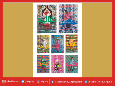
While, the print and outdoor imagery raised a Sri Lankan brand to international aesthetic standards by the use of irreverent youth montage style collages. Almost putting the brand on par with any international iconic youth fashion brand. Suddenly for a country's youth used to feeling awkward about most things local, Sri Lankan-ness became a cool youth badge value aspiration throughout the island.
Red and Blue are colours most associated with the category. So, the brand employed both to own the category and rendered the communication with a pop-art style, to give it a look that appeals to the youth. And to keep with the flitting mindset of young, the agency decided to do away with formats and standard layouts. Instead ensuring that all the communication felt like part of the same family, but no two pieces of communication ever looked the same. Whether it was outdoor/retail/print/store signage etc, everything had a unique, vibrant look to it. So much so, that even the font on the baseline was never repeated.
The print campaign was shot in Sri Lanka using actual youth of Sri Lanka, the photographer was Amol Jadhav from Mumbai India, the various pop art illustration that one sees in this campaign were done by quite a few illustrations, some in house from Taproot and some were out sourced in Mumbai.
The TVC too was shot in Srilanka which is produced by Yellow Lemon Grass Production. Talking about the whole process of creating the new brand and its communication, Santosh Padhi, Chief Creative Officer and Co-Founder, Taproot India, tells Adgully, " We always thought there will be a good overlap of both the market (ours and lankan) but with few of our market visits and consumers interaction, the market just proved us wrong, the youth there have a very definate taste towards most things in life, the youth has a right balance of the West blend into the Sri Lankan culture. So initially we felt bit worried but with the whole of Triad advertising agency around things looked much easier towards the launch."
Recently KIK crossed 25% market share and as always, come what may, the brand continues to be "Lankan to the last drop'.
Elephant House is one of the largest F&B brands in Sri Lanka. For years, they've dominated the two categories with a slew of iconic brands like EGB (Ginger Beer) and a whole range of popular ice creams. However in the past few years one of the world's leading cola brands has been making inroads into the Lankan market place with their typical brand of young, cool, imagery targeted mainly at the youth. And cola was a category that Elephant House never had a presence in.
KIK Cola was launched in December 2010 with the now famous tag line LANKAN TO THE LAST DROP.
Creative directors : Agnello Dias, Santosh Padhi
Art Director: Santosh Padhi
photographer: Amol jadhav
Account servicing / Planning : Manan Mehta, (Dilith Jayaweera, Varuni Fernando, Michael Holsinger of Triad Advertising, Sri Lanka) | By Prabha Hegde [prabha(at)adgully.com]


Share
Facebook
YouTube
Tweet
Twitter
LinkedIn