
Tenon Group revamps brand logo on completing 22 years
The leading Integrated Security & Facility Management Corporation – The Tenon Group has undertaken a massive brand identity overhaul and revamped the logo. It is the biggest repositioning since its inception about 22 year ago. The new identity reflects both the evolution of the company as well as its vision for the future.
Over the last two years we have significantly expanded our global footprint and are present in a leadership position in India, UK and Singapore. The rebranding coincides with the Group’s global vision and strategy to align and synergies our various business verticals present across the geographies. It is also about repositioning Tenon in the context of the competitive environment we operate in. It reflects our desire to focus on qualities that differentiate us from our competitors.
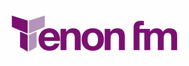
The contemporized logo with its modern look, colour and lines captures the new positioning.
Over the years, colours have been used to represent the branding of various Tenon Group companies. Each have been distinctly individual from the other.
In the rebrand scenario, a colour palette of a single colour – Purple, has been adapted to create a synergy across verticals. The use of purple further demonstrates our boldness and makes a strong representation of our unique vision for the company. An uncluttered colour palette also ensures harmony and creates a faster recall. The new look is stylized and with fresh typography that is streamlined with the colour palette that binds together the three main companies emanating from the Group.
The company now plans to streamline their various Business Units and strengthen it under 3 key verticals:
- Tenon FM – Will globally provide Facilities Management services
- Peregrine- will deliver comprehensive security solutions
- Soteria – For remote services
Commenting on same, Maj. Manjit Rajain, Group Chairman, Tenon Group said; “Tenon over the last two decades has experienced exponential growth and we feel it is the right time to investment and align our marketing strategy with our business opportunities. Our refreshed brand goes much deeper than just a new logo and colour. It reflects our commitment to creating ‘clients as partners for life’, as has been the case for the past 22 years. While the brand colour and typography have changed to better represent what the company is today, Tenon’s value proposition remains the same – our combination of excellence in service, exceptional client engagement and deeper industry expertise remains unique, and enables us to develop long-lasting and rewarding client relationships.”
Since 1995, Tenon has been a pioneer in providing integrated security and facilities management services. With a turnover of over INR 1500 crores globally, the company targets to grow 22 – 25% in next 5 years.

Share
Facebook
YouTube
Tweet
Twitter
LinkedIn