
The 20th Edition of Asian Paints ColourNext launches forecast stories
Asian Paints ColourNext, the most authoritative voice in the Indian subcontinent for trends and material forecasting completed 20 years this year. Renowned for their exemplary insights, ColourNext continues to share design directions for the year inspired by the cultural and social influences on colour and decor trends. ColourNext revealed the four forecast design directions for 2023 – ‘Gothilicious’, ‘Edge of the Forest’, ‘Sleep Sense’ and ‘Shroom’, the stories of which address sociocultural topics ranging from how we express ourselves, to a newfound urgency for wellness, and forming deeper connections with others and the world around us. The forecast also launched Wallpaper of the Year – AION, breakthrough natural and earth-safe paint - Nilaya Naturals, and imaginative palette of wall finishes called Material Finishes by Royale Play.
ColourNext’s forecast for 2023 is all about building a better future, embracing the past and present and creating with joy, hope and intention. The year is the silver lining everyone waited for, after the dark clouds of the past few years and the colour of the year 'Silver Escapade' encapsulates the optimism with which we are going forward. On the occasion of ColourNext’s 20th edition, Asian Paints has also launched the new logo for ColourNext.
Mr. Amit Syngle, Managing Director and CEO, of Asian Paints Ltd. commented, “As we celebrate 20 years of ColourNext with pride & zest, we look ahead to share with the world, the colour and material forecast for the year. The design directions for the year - Gothilicious, Edge of the Forest, Sleep Sense and Shroom highlight self-expression, wellness, fantasy and connecting with the world, addressing socio-cultural and consumer shifts which have emerged from getting out of a rather difficult and tough phase of the last two years. The Wallpaper of the Year- Aion speaks about time and eternity through art and design and Nilaya Naturals along with Material Finishes by Royale Play align perfectly with our forecasted themes for the year. We are excited to see the multitude of interpretations of our directions across landscape and medium. It is definitely going to be an interesting year where we see the application of our forecast and our colour and material intelligence behind them come to life.”
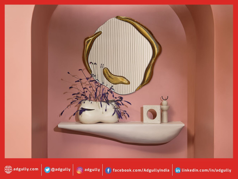
The dazzling and enchanting Wallpaper of the Year, AION (pronounced Ahee-ohn) has a mesmerizing visual palette with deft use of tones in different sections of the design. In the foreground, strong powerful and modern graphic lines, blaze with a white intensity. Receding totem silhouettes signal the way back into myth and mist, hanging chandelier-like against a soft wash of colour. ‘AION’ offers more than the eye can see and tells a tale of the universe’s greatest puzzle: Time.
Each of the forecast stories outline a narrative that connects with individuals differently.
Gothilicious is the trend of self-expression and being unapologetically bold and sensual. It can be seen as challenging the traditional ideas of dark and nebulous and exploring the intensity of pensive and powerful human emotion. There is a shift towards an understated gothic essence with colours like charcoal warm matt black, deepest dark skies, blackest black pigment, deep dark forest olive greens, dark reds, sheen & shimmer of mother of pearl and molten metal.
Edge of the Forest is a life-affirming and a restorative forecast story. When the pandemic hit we were clouded with loneliness, people found themselves turning to nature for answers, as per big data reports. This is because people know from instinct that nature allows them to connect to a world larger than themselves. Inspired by unfiltered forests, woods and its many enchanting creatures, this forecast story includes deep forest greens, mud, moss browns and mystical fluorescence inspired by wildflowers, rare bees, bugs and worms, along with the magical sheen and shimmer of gleaming lake waters. This trend signifies reconnecting with nature and its joy and vitality and a new kind of ‘inland living’ at the edge of the forest.
Sleep Sense refers to a new frontier in wellness – a sleep revolution i.e. prioritizing good quality sleep and rest of mind as the movement towards health, wellness and slow living gains ground. There is a renewed focus on breathable, handcrafted fabrics and locally sourced natural materials. The overall colour palette is a collection of broken whites that give a feeling of stillness and lightness. Comforting, nourishing, soft adaptive, familiar, and tranquility are the colour and material qualities of this forecast story.
Shroom is a story of revival and rebirth. It involves taking all that is dead and turning it back to life, in many ways mirroring the year itself, as people come out of the biggest health scare this generation has witnessed. It seems simple from the outside but has complex layers of ecological memory. A palette of profound tones combined with luminous and saturated hues with mesmeric quality make up this forecast story.
Earlier this year, Colour of the Year - Silver Escapade was unveiled as a representative colour of the times we live in. Wellness and hope for the future have emerged as the two most important design trends this year which inspire silver, a ubiquitous colour of hope, festivities and glamour. Silver has been the colour of auspicious new beginnings in India for centuries. Given the hybrid lifestyles we live, the colour is timeless and expansive transcending physical and digital realms, the past, present and the future.
Having been in existence for 20 years, Asian Paints ColourNext has evolved as the subcontinent's most-awaited and one-of-its-kind, intelligence in colour and material. The entire forecast takes into account the impact of the socio-political-economic climate backed by the science of research tools and colour psychology. It is put together based on comprehensive research involving the country’s prominent tastemakers from the fields of architecture, art, interiors, fashion, sociology, media and FMCG. Over 20 years, ColourNext has grown its influence and manifestation having immensely contributed to and shaped the world of colour and design.
Along with ColourNext, Asian Paints has revealed its new breakthrough product, Nilaya Naturals, a uniquely luxurious earth-safe, lime-based paint. Nilaya Naturals is made with 90% earth-positive ingredients making it robust and breathable, with a clean, fresh smell. Its tonally perfect palette with a vintage, flawlessly matte finish, has a beauty that only grows deeper with time. For projects which require an artistic colour, this will prove to be a perfect choice.
Material Finishes by Royale Play which are designer plaster solutions will showcase textures, styles and decor effects inspired by the colour of the year and forecast stories. This dynamic product offers a variety of options to fit evolving consumer tastes, such as The Archi Argilla, an imitation of nature with natural clay and lime composition; fit for houses with a trendy-chic rustic style, or W2F Decorative for differentiated luxury spaces. Some other options include Opaco Matt’s complete matt styling, and Marmorino’s marble like effect among others.


Share
Facebook
YouTube
Tweet
Twitter
LinkedIn