

The Wadhwa Group breaks the glass ceiling with ‘Wise Living’
What’s a typical real estate communication campaign like? Large images of the facade, swimming pool, lobby, the landscape… pretty pictures with flowery messaging about the idyllic life, or a hard-sell based on rates. In most real estate advertisements, you could swap the logo of one for another and it would still work.
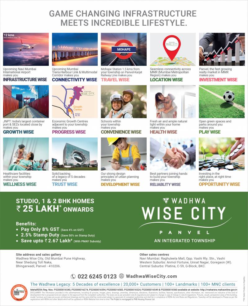
The very first campaign for upcoming integrated Township Living project “ Wadhwa Wise City @ Panvel “ , shows that real estate advertising isn’t a formula. Wise Living, the basic premise of the campaign is unique and inherent in the name Wadhwa Wise City itself.
Priyansh Kapoor – Head Sales, Marketing & CRM at Wadhwa Group Says: This project is very important to us. We are known for our strong focus on planning and design aesthetics, and the same values form key pillars of this township. Located in emerging hotspot of Panvel, it offers quality affordable homes to ease the travails of first-time home buyers, for whom owning a quality home is a distant dream. So the communication challenge was to position Wadhwa Wise City as a massive and integrated project that delivers tremendous value with an incredible lifestyle, redefining what a budget home includes.
The resulting campaign redefines advertising for value homes. It dispels the myth that communication for affordable housing needs to look ‘less premium’ and shout for attention with large fonts and loud colors.” Whether it is the visual theme of ‘Building Bars’ used in prelaunch phase interpreted as a row of buildings or simply signify growth story across the landscape, symbolic of the integrated township or the use of “WISE “strongly to substantiate important facts and USP of project be it in headline or images – they highlight each of the key focus points of the communication in the context of a holistic living experience– be it the upcoming airport, the amenities or the well-planned apartments , true to the promise of living in the lap of nature and well balanced lifestyle at Panvel reinforcing the brand connect of ‘Wise’ strongly.
Shonali Shetty, Head Marketing says, the entire campaign has turned out to be clutter-breaking creating a distinct, memorable identity for brand Wadhwa Wise City. The visual language is modern, clean, with use of vibrant colors depicting various facets of Project. The campaign will be rolled out in phases across multiple media with a Digital First approach along with Print, OOH, Radio and more. Videos rolled out across digital platforms has been very well received, managing to create perfect pre buzz and positive sentiment overall. Through multiple touch-points, the campaign will showcase Wadhwa Wise City for the many reasons that make it a wise proposition.
Campaign Credits:
Madhatter Productions
Red Reel Productions
Triton Communications


Share
Facebook
YouTube
Tweet
Twitter
LinkedIn