
Vi makes India stand up and take notice... but, what’s the idea Sirji?
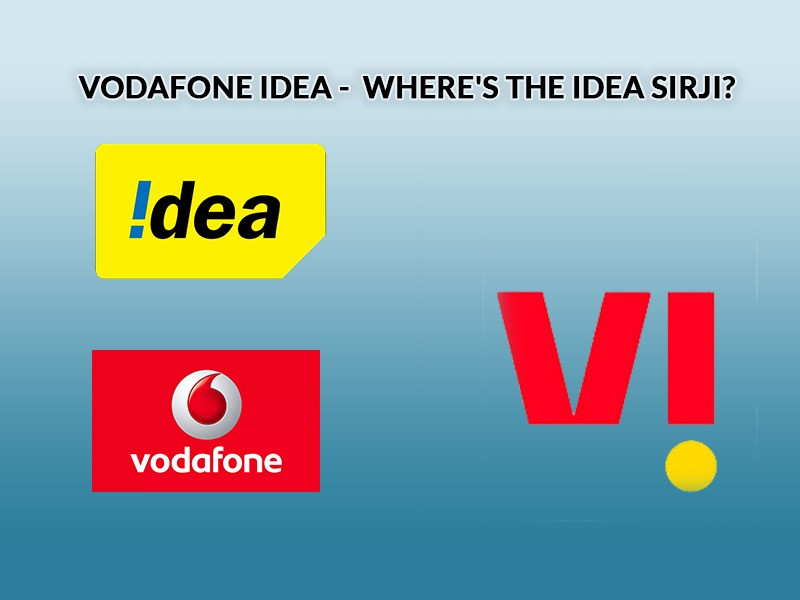
On September 7, 2020, Vodafone Idea, that had merged around two years ago, finally introduced their new brand identity as ‘Vi’ (pronounced as We). The announcement was made at a virtual conference. Touted as one of the biggest telecom integrations in the world, the new identity has been crafted by Wolff Olins, a brand consultancy based in London, New York City and San Francisco.
The new brand identity is pegged as future-ready. According to the brand, Vi is built to be strong, ever-dependable, agile, intuitive, and a brand in tune with the needs of the customers, in these ever-changing times. It is designed to help customers move ahead in life, for a better today and a brighter tomorrow.
Announcing the new brand identity of the merged entity, Ravinder Takkar, MD & CEO, Vodafone Idea Ltd, had said, “Vodafone Idea came together as a merged entity two years ago. We have, since then, focussed on integrating two large networks, our people and processes. And today, I am delighted to present Vi, a brand that will bring important meaning to lives of our customers. Indians are optimistic and want to get ahead in life. They would love a credible partner to help them on this journey. Vi’s positioning is built around this promise and will focus on meeting the customer needs to help them thrive.”
Also read:
Vodafone and Idea Brands are now 'Vi'
While a new brand identity was in the offing, there have been mixed industry reactions to Vi – while some felt that the identity was apt, others have raised questions as to whether it dilutes the brand identities of both Vodafone and Idea.
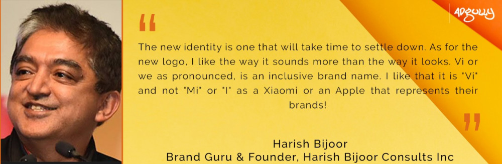
Harish Bijoor, Brand Guru & Founder, Harish Bijoor Consults Inc, remarked, “With the new brand and brand identity in place, the two old brands are dead in their old forms. Vi is the daughter of Vodafone and Idea – to that extent, in the DNA of the new brand, Vi, resides the collective brand equity built by both brands assiduously over the years. I am sure we will see Vi recalling some of those fond memories in its advertising ahead.”
According to Bijoor, the new identity is one that will take time to settle down. “As for the new logo, I like the way it sounds more than the way it looks. Vi or we, as pronounced, is an inclusive brand name. I like that it is "Vi" and not "Mi" or "I" as a Xiaomi or an Apple that represents their brands!”
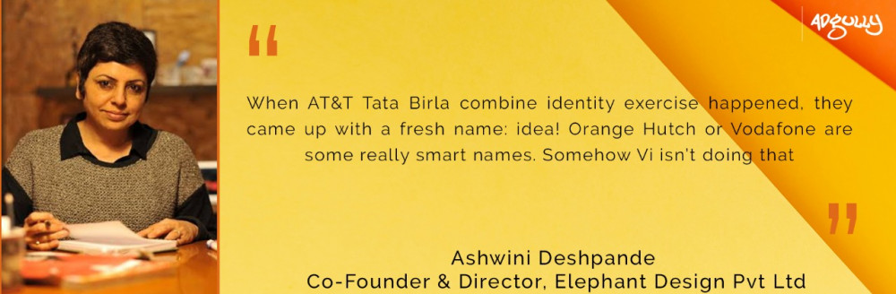
On the other hand, Ashwini Deshpande, Co-Founder & Director, Elephant Design, felt disappointed as a user and as a designer. She said, “Vi reads like a Roman 6, would most likely be pronounced as ‘why’ and the dropping yellow penny makes it rather unstable. The identity seems like a missed opportunity to do something new, break away from the old name, old colours and old way of doing visual identities. When AT&T-Tata Birla combine identity exercise happened, they came up with a fresh name – idea! Orange Hutch or Vodafone are some really smart names. Somehow Vi isn’t doing that. On my screen, I am seeing ‘Vi is here’ and not ‘V! are here’ and that’s not aligned to the intent either.”
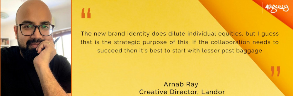
Arnab Ray, Creative Director, Landor, commented, “I think both brands had built a fair bit of equity in their own way. Vodafone, of course, more iconic from an identity point of view. All the communications work gone in for both brands made it resonate well with their respective audiences over time. Also, both had very different sensibilities – one being more mass/ theatre and the other more multiplex/ bordering upper middle class. Anything built over time is hard to let go off. Having said that, yes, the new brand identity does dilute individual equities, but I guess that is the strategic purpose of this. If the collaboration needs to succeed, then it’s best to start with lesser past baggage.”
He further said, “I have a personal affinity towards the Vodafone identity as a designer, as it is iconic by itself. The brand expressions have been awesome as well over time. I am a Vodafone user since the beginning and the brand and its communication have appealed to me always. But what the new identity has done in my mind has a lot to do with the way it is called – Vi for ‘we’ – and has added a new meaning altogether. The launch commercial helped too in a way. Guess that was the point of it. To hammer in the name. And I am being able to see it in a new light, leaving behind my immediate associations with Vodafone. Long term ones will take time. So yes, I do feel it is impactful in that sense. Change is never easy and people will always compare, but then to be fair, Vi has to be viewed as a new brand and not compared.”
As far as the logo is concerned, Ray believed that it told the story, was bold with a majority of red (Vodafone), which he felt was more of an aesthetic call than a business one and was digital friendly. However, he was not sure if it was iconic or fresh in nature. “The ‘I’ turned upside down to form ‘!’ is not new. (Incredible India came way back) I am yet to see the full expanse of the visual system, but from what little I have seen, there seems to be a lack of cohesiveness – if you see the last two frames of the ad, the flowy graphics versus the sharp logo formation in the end tell two different stories. From a messaging point of view – ‘Together’ is a premise which has been visited a million times, but then I guess it comes together well for this particular purpose and is summed up well when we see – togetherness is a wonderful thing. It will be great to see how ‘Together for Tomorrow’ will play out in the future. Look forward to more from the brand.”
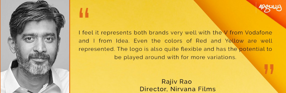
Rajiv Rao, Director, Nirvana Films, too, felt that Vi represented both the brands very well with the V from Vodafone and I from Idea. “Even the colours of red and yellow are well represented. The logo is also quite flexible and has the potential to be played around with for more variations. Since the new identity is completely different from the previous brands, people will take their time to settle down with it, but I’m sure it will be accepted soon as long as the new identity showcases the persona of both Vodafone and Idea,” he added.
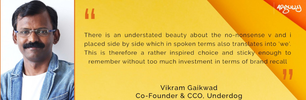
For Vikram Gaikwad, Co-Founder & CCO, Underdog, the simplicity of the identity was its very strength and would most definitely resonate with the audience too, which as we all understand is a massive universe of people cutting across SECs. He further said, “There is an understated beauty about the no-nonsense V and i placed side by side, which in spoken terms also translates into 'we'. This is, therefore, a rather inspired choice and sticky enough to remember without too much investment in terms of brand recall. Between the two, it is slightly more reflective of Vodafone’s than Idea’s identity, but the inverted exclamation mark that reminds us of Idea is also a great touch.”
The reveal of the new identity is supported by a brand campaign, conceptualised by Ogilvy India.
Watch the ad film:
On the day the campaign broke, Vi did a roadblock on ZEE network channels. Elaborating on the idea behind the communication, Hirol Gandhi, President And Integrated Brand Team Leader, Ogilvy India, told Adgully, “There were two key tasks for the launch communication:
- Establish awareness and recall for the new brand and also pronounce it correctly
- Tell the whole world about the transition: Vodafone and Idea are now Vi
The coming together of Vodafone and Idea is wonderful, as it unlocks great value for customers. The launch communication showcases people from all walks of life coming together to welcome this new brand and herald a better, brighter tomorrow.”
However, netizens think otherwise and have voiced their opinions and reactions to the Vi launch campaign on social media. Here’s what Twitteratis had to say:
Iam irritated too #VI #irritating #TrendingNow #Trending pic.twitter.com/bR1ConSVGT
— Chetan Chavan (@cc5467) September 8, 2020
Rookie French students trying to say 'Yes' in French. #vi #vodafoneidea pic.twitter.com/8l5A2pRxIn
— Kriya Jain (@ek_joota) September 8, 2020
Jio: We are the best
— Sagar (@sagarcasm) September 8, 2020
Airtel: No. We are the best
Vodafone Idea: Vi Vi Vi Vi Vi Vi
After watching Vodafone-Idea ad VVVVVVVVVV whole day
— Chirag Soni🌟 (@_chiraxx_) September 8, 2020
Le*me(dimag ka bharosa hua )😂 pic.twitter.com/YL5DlUd8sM
People after seeing Vodafone Idea VI ad #vodafoneidea pic.twitter.com/jSJSyUHQo6
— â„â„ð•€ð•‹â„ð•€ð•‚ ð•ð”¸ð•€ð•Šð•Žð”¸ð•ƒ (@the_hrkjais) September 7, 2020
Vodafone and idea: *collaborate*
— ismart pillagadu (@vanamaliacharya) September 8, 2020
Vodafone: So what are we gonna name our new company?
Idea: pic.twitter.com/7FROcOSd20
Dear @VodafoneIN @Idea
— Y U V R A J (@yuvrajkandekar) September 7, 2020
Totally agree Rebranding is necessary and marketing too.
But it should not be so irritating that people will start switching to another Network jus watching and getting irritated due to #VI long Advertisement pic.twitter.com/uRqaJukLYw
Me to the guy who made VI advertisement #vi#vodafoneidea pic.twitter.com/94WoentrFi
— Vikram Goda (@GodaVikram) September 7, 2020
Me waiting for VI ad to finish #VI #vodafoneidea #irritated pic.twitter.com/5qrqRBq4sT
— Tejas jain . (@tweet_theTJ) September 8, 2020
Me after watching #VI commercial for 10987656342 time!!!!!
— Dee (@not_a_messss) September 7, 2020
Kitni irritating ad hai yaaaaaar ðŸ˜ðŸ˜ðŸ˜ðŸ˜ðŸ˜ðŸ˜ðŸ˜ðŸ˜ðŸ˜ pic.twitter.com/yUGJnRKSqP

Share
Facebook
YouTube
Tweet
Twitter
LinkedIn