
WOW Design unveils a new brand identity given to Dabur’s Real Activ Range
WOW Design, a strategic brand design consultancy, has collaborated with Dabur, renowned FMCG Company, to revamp the brand identity for its range of Real Activ Juices. Dabur intended to revamp its range of Real Activ juices that have no added sugars and vouch for a healthy juice, anytime, anywhere. With a record of successful revamp launches in their kitty, WOW Design was invited to impart a new look for the Real Activ range differentiating it from competition, on the shelf and in the minds of its consumers.
Understanding the concept of Being health conscious
The brief to , the team at WOW Design was that the packaging and proposition story of the brand had to be needed a makeover such that it becomes a preferred choice to the health conscious consumer who walks an extra mile to enjoy an active life.
Working towards a new look for Dabur Real Activ Range, WOW Design conducted a detailed research based study. The key findings of the study were:
- The visual architecture of the existing Activ range resembles closely to the main range; diluting its differentiation from the sub-ranges.
- The core proposition of ‘Supporting Fit & Active Lifestyle’ missed precedence due to lack of effective packaging communication.
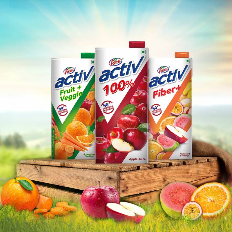
Hence, considering that the Activ range has varied offerings, WOW Design aimed to highlight the benefits of each range and establish them separately. For the same, they introduced two levels: Sub-Range – 100%, Fibre+ and Fruit-Veggie & its variants.
Design solution: Applying The concept of ‘Purposive Partner in Activ Lifestyle
Scrutinizing the target group’s consumption and buying behaviour, helped in drawing useful conclusions. The concept of ‘Purposive Partner in Activ Lifestyle’ emerged from the brand’s core proposition of ‘Supporting Fit & Active Lifestyle’. This idea augmented a makeover of the visual architecture for differentiation. A key element, the ‘Right Tick’ emerged from as a strong design architecture. Capturing Real Activ’s brand essence of premium quality & purity, visual shots of natural, fresh fruits and veggies, and impactful mnemonics were leveraged upon. Adding stars to the design was the vibrant white colour that created the most desired differentiation.
On this association Kumar Mayank, Head Marketing, Dabur Foods said, "We at Dabur took WOW Design on board for revamping Real Activ, which is a critical brand in our beverages portfolio. I would have to say that the WOW Design team have a thorough understanding of the consumer pulse and they do their research very well to grasp the market dynamics. We were impressed by process followed by them for arriving at the design strategy. They dive deep into consumer psyche and draw insights beautifully that does the magic on the design solution in the end. I appreciate the Design thinking led process they follow that can helps create breakthrough designs. The new Real Activ has hit the market recently and we have positive reviews from all corners about it."
Speaking on the new brand identity, Ms Deepti Kshirsagar, Partner & Executive Director WOW Design said, When talking to the consumer who are health conscious, we realized most of them are fence sitters and on lookout for products /brands that would propel them to actively pursue their fitness goals. We translated this sentiment into the design with the Check Tick as a core element that would resonate with the consumer maming him feel that he is not only choosing the right brand but by doing that also ticking off one of the things in his fitness goal by having made a healthier choice.
Mr Saswata Das, Partner & Executive Director, WOW Design adds, In terms of Dabur’s flagship beverage brand Real's Brand Architecture, Real Activ stood as an offering for the more health conscious and fitness freak consumer. However, the consumer till recently couldn't differentiate between Real and Real Activ, more so because they had similar flavour variants and packaging which did not bring out the difference. We used Design as a strategic tool to help communicate the difference and bring the Brand Architecture actually to life, making it easier for the consumer to decipher which product is for her and what's the value proposition. Real Activ was given a fresh new packaging encouraging the right consumer to make the right choice
The new pack design resonated well with the consumers while making the brand stand out on the shelves prominently; convincing that Real Activ is indeed their ‘Purposive Partner in Activ Lifestyle.


Share
Facebook
YouTube
Tweet
Twitter
LinkedIn