
YouTube Shorts makes its design journey from mobile to TV
Starting today, YouTube Shorts is launching on TV. With this, viewers will be able to enjoy these bright bursts of video (60 seconds or less) on the big screen at home.
In a blog on YouTube’s website, Brynn Evans and Melanie Fitzgerald, UX Directors, YouTube, take a look at the design process of expanding Shorts to this new surface, taking a deep dive on what it takes to bring mobile-first video formats to the TV screen.
While expanding Shorts to TV may seem straightforward conceptually, the journey to get here was not as simple as it sounds. Evans and Fitzgerald share a behind-the-scenes look at the process of bringing a vertical, mobile-first format to TV.
A look at the planning process
To make this moment happen, product managers, engineers, designers and researchers from the Shorts and TV teams came together to discuss how to bring this new video format to the big screen. It was important that the Shorts experience on TV felt consistent with what the community sees on mobile and also natural on the bigger screen.
Love me, love me not
To better understand what viewers would like from a Shorts experience on TV, we took an unconventional approach to our research and asked participants to write either “Love” or “Breakup” letters to express their feelings about short form content on TV today. The “love letters” showed that viewers liked the community experience, watching content they love easily with friends and family. Meanwhile, the “breakup letters” showed that people felt it could be clunky, slow to load or lacked key features like sharing. Here are two examples of the notes YouTube received:
“I was skeptical before we first met but I must admit you showed me things I didn’t know I was missing — the larger screen was a bigger and more comfortable viewing experience.”
“I feel you have a little way to go before you’re ready for a relationship — be more user friendly... be easier to navigate.”
Making the jump from mobile to TV
Evans and Fitzgerald further stated that research revealed that there would be unique perks of watching Shorts on the big screen. They’re easier to watch with others, and the larger screen makes it a more comfortable viewing experience. But the design challenge remained: how could we preserve the essence of Shorts with vertical videos on wide screen TVs? YouTube started by creating three very different design concepts:
It wanted to know if the unique feel of Shorts could be conveyed in conventional video player (Option A) or if it should be customised to better fill the blank spaces on either side of the video (Option B). They also considered a divergent option — the “Jukebox” style (Option C)— where multiple Shorts would fill the screen at the same time, taking full advantage of the TV screen’s additional space.
After another round of research, feedback showed that the joy of Shorts gets lost in the consistent video player (Option A), and the Jukebox style (Option C) strayed too far from the essence of Shorts, which features one video at a time. The customised Shorts experience delivers the best of both worlds: a clean design while making the most of the wide screen’s additional space.
The platform also learned that viewers wanted to be in the driver’s seat of the viewing experience and were happy to use the remote to manually advance to the next Short rather than have the feed autoplay. This was unusual. Typically, it is found that level of interactivity can be tedious with a remote, but in this case, short-form video is unique. Research indicated that people want to take charge of the viewing experience — just like with Shorts on mobile — and even expected it.
Using prototypes to bring Shorts to life on TV
In the final phase of design, YouTube created two high fidelity prototypes of a customised Shorts video player that incorporated feedback from the latest round of research. Now it was trying to balance a pure viewing experience with features that people expect from Shorts and YouTube, like comments, community actions (for example, Like, Subscribe) and finding related videos.
The “simple” prototype included the bare minimum: sidebars and basic functionality for engaging with Shorts. The “maximal” prototype gave a lot more visible functionality, from related tags to comments and included a color-sampled blurred background.
When these prototypes were tested with the community, it was found that people preferred the “maximal” version. It made better use of the TV screen’s additional space and the colour-sampled background made the experience feel more modern.
Bringing the learnings live
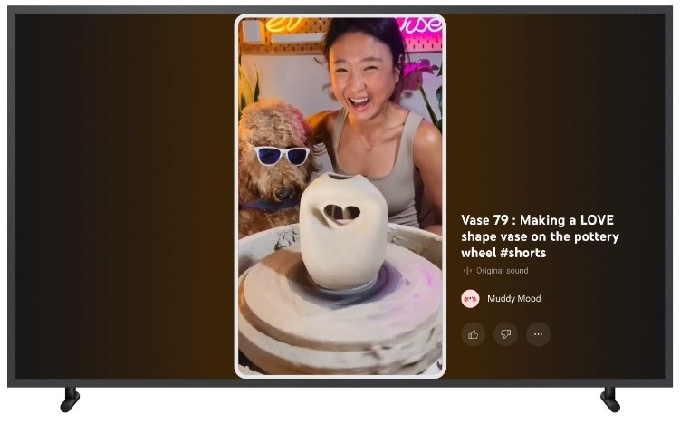
In the design rolling out, a modified version of that “maximal” prototype will be presented. YouTube has simplified the design of the right side rail, but will be looking to bring in additional functionality in future releases. This experience is expected to balance the fun and quirkiness of Shorts in a way that feels natural for TV.

Share
Facebook
YouTube
Tweet
Twitter
LinkedIn