

Kings XI Punjab unveils new look with launch of its new logo
Commenting on the launch, Col. Arvinder Singh, COO, Kings XI Punjab, said, "This new look logo is more vibrant, contemporary and user friendly. It embodies the essence of the ethos that Kings XI Punjab stands for."
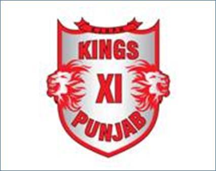
The new Kings XI Punjab is all about winning, a determination reflecting in every aspect of the franchise's new logo. The shield signifies the strength of character and fortitude of the conqueror - the qualities entrenched in each player of KXIP.
Like the lions in the logo, the team will fight a fierce battle and prove to be the Kings of the IPL jungle. The KJHPH band in the logo represents Jammu & Kashmir, Himachal, Punjab and Haryana and symbolises the effervescent and resilient spirit of the people of these regions. Last but not the least, the Kings XI Punjab in the centre represents the XI players who will take the field by storm in true Punjabi style and emerge as winners with a positive and enterprising attitude.


Share
Facebook
YouTube
Tweet
Twitter
LinkedIn