

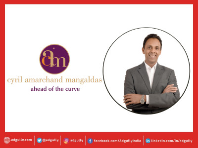
Interbrand sets a precedent, reveals Cyril Amarchand Mangaldas new identity

The country's best-known legal services firm, Cyril Amarchand Mangaldas (a successor firm of the erstwhile Amarchand and Mangaldas and Suresh.A.Shroff and Company) today unveiled a fresh brand positioning and identity for the firm, at its first Founder's Day celebration.
The high profile event was attended by industry leaders like Deepak Parikh, Uday Kotak, Gautam Adani to name a few.
Speaking at the event, Cyril Shroff, Managing Partner, Cyril Amarchand Mangaldas said, Cyril Amarchand Mangaldas is like a start-up with a hundred year old history. So, while we are unveiling a new identity and fresh thinking today, the values and the principles that we have internalized are over a hundred years old. In many respects therefore, this new identity is like taking those same values into a new dawn.
The identity has been designed by Interbrand, the world's largest brand consulting firm, which offers a 360 branding services suite to renowned brands the world over. On the Cyril Amarchand Mangaldas partnership, Ashish Mishra, MD, Interbrand India, said, As Interbrand India, We are committed to helping the Best Indian Brands navigate their ambitions to become the Best Global Brands. We are delighted to be entering into a long term partnership with Cyril Amarchand Mangaldas which is the country's top law firm and has the potential to emerge as a strong global brand too. As a matter of fact, through the project, the new vision for the brand has already been articulated. And it is to emerge as the top law firm from Asia by 2025.
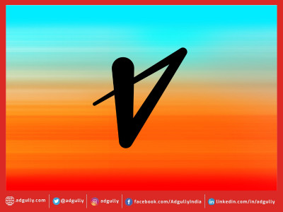
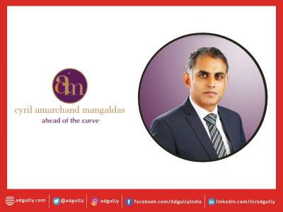
To express this position, the identity draws from demand drivers that are considered most compelling in client choice ¿ heritage, knowledge, expertise and relationships. The identity builds on these factors symbolically:The ring of gold is a symbol of unity and infinity. Gold as a color embodies tradition, brilliance and success. Wisdom, integrity dignity and ambition are qualities that are represented by the color, violet. While the orange in C stands for warmth and friendship.
The identity makes use of an interesting concept of ligatures, or letters that are joined to form shapes. Thus, C, A and M appear joined to each other within the golden ring, thereby symbolizing the tightly knit relationships both, within the firm and with clients.
Apart from the play of letters and colors, the placement of the dot also reveals an element of surprise the formation of an elephant within the circle. The elephant symbolizes strength, intelligence and longevity the qualities of the firm that make it so valuable to clients. And the fact that it is hidden within the symbol implies intelligence and insightfulness traits crucial for a law firms ability to see things that others don't. That's a hallmark we would want to build through experiential reinforcements for the brand going forward added Mr. Mishra.


Share
Facebook
YouTube
Tweet
Twitter
LinkedIn