

Isobar India creates Uncafe’s design identity for its new & healthy salad café
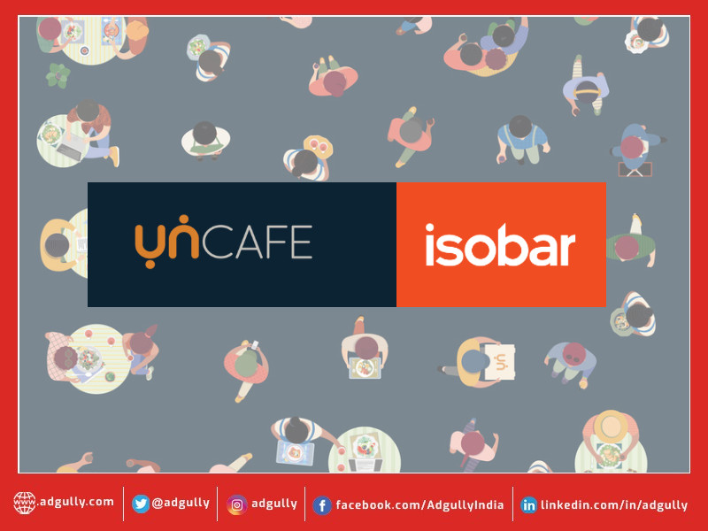
Uncafe, a one of its kind boutique restaurant, has entrusted Isobar, the creative experience agency from the house of dentsu India, to design the identity for its newly launched healthy salad café.
The brand has taken a step further by creating a place that does not compromise on nutrition, hygiene, and taste. With this, Uncafe hopes to bring some delectable farm-to-fork meals, a sustainable food ecosystem and a smile on every face. Keeping this at the core, the design crafted by the agency highlights Uncafe’s understanding of a consumer’s lifestyle and health needs in a contemporary manner.
While the logo comprises the alphabets ‘U and N’ from the brand name, the two dots are inspired by the Yin and Yang correlation symbol - the coherent synergy of taste and wellness. The alphabets U and N with two dots depict two humans, which in this case is the coming together of like-minded souls. The form is devoid of any frills and finished with soft rounded edges. It connotes inclusivity, friendliness, and warmt
Commenting on the new identity, Sanskriti Gupta & Riti Gupta, Co-Founders, Uncafe said, “There has been a sudden shift in the mindset, especially with the next generation becoming more conscious and responsible. We at Uncafe intend to promote an un-boring, unpretentious, and unapologetic healthy lifestyle.”
Rahul Vengalil, Managing Partner, Isobar India commented, “Back in the day, the definition of healthy was anything that didn’t have carbs, fats and sugar. But today owing to the pandemic, it’s all about immunity-boosting foods and paying attention to quality. Having said that, the offerings at Uncafe ticks all the right boxes. With an aim to deliver a holistic brand experience, we conceptualised the design in alignment with the brand values and built further on the health proposition.”
Aalap Desai, National Creative Director, Isobar India added, “A brand like Uncafe is helping the term ‘healthy food’ shed its boring tag. Our design is an endeavour to convey this message and to showcase what the brand stands for i.e., wholesome goodness anywhere anytime. The logo also has a deeper meaning and a style that would appeal to different age groups while we attract Gen Z’s attention.”
Agency Credits:
National Creative Director: Aalap Desai
Senior Vice President Strategy: Pragati Rana
Senior Creative Director: Sreejita Chakraborty
Associate Creative Director (Copy): Sandipan Deb
Associate Creative Director (Art): Saurav Banerjee
Creative Supervisor: Abdul Ajharuddin Ahamed
Senior Art Director: Prashanti Nagashree
Designer: Dron Kumar
Associate Account Director: Juhi Chaudhary


Share
Facebook
YouTube
Tweet
Twitter
LinkedIn