

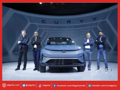
Tata Passenger Electric Mobility introduces new brand identity
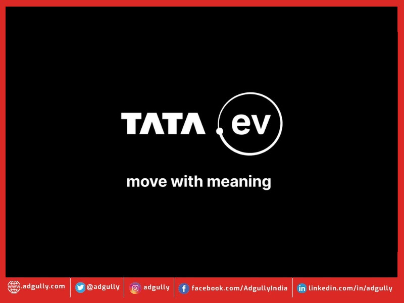
Tata Passenger Electric Mobility, a subsidiary of and the pioneer of India’s EV revolution today launched its new brand identity, TATA.ev, for the EV business. This new identity is aligned to Tata Motors' commitment on sustainability & pioneering innovation as well as Tata Group’s focus towards community development. The new brand identity embodies the core philosophy of "Move with Meaning," unifying the values of sustainability, community, and technology. It is the first step towards providing differentiated and meaningful experiences for customers in the form of a collective initiative to move towards an electric future that is better for the planet and its inhabitants.
As the EV offering grows, spurred on by surging consumer demand and a robust, thriving product lineup, customers expect a unique experience across all touchpoints, from the brand to the product and its ownership cycle. TATA.ev identified a clear need for a new consumer-facing brand identity that strengthens commitment to the future of mobility.
MOVE WITH MEANING
The word “move” captures how the company is in the business of mobility but also acts as a launchpad to think of this new brand identity as a collective human movement towards EVs, and towards a Safer, Smarter, Greener future. The words “with meaning” build on the intent – they power up what TATA.ev stands for with a clear focus on responsibility, collective action, and future readiness.
Commenting on the new brand identity, Mr. Vivek Srivatsa, Head, Marketing, Sales and Service Strategy, Tata Passenger Electric Mobility Ltd. said, “We are entering a new era with TATA.ev. Our new brand identity for electric vehicles underlines our commitment to accelerate the adoption of clean energy mobility solutions. We intend to drive positive change in the automotive industry with the focus on sustainability, community, and technology. Both the products and services are intended to create highly differentiated and meaningful consumer experiences. The brand personality is humane, honest, invigorating, and conversational – a rallying point for those curious about having a better impact on the world.”
Key highlights of TATA.ev’s brand identity
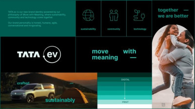
The brand identity of TATA.ev, developed with Landor & Fitch, reflects the brand platform 'Move with Meaning' with sustainability at its core. All design decisions are purposeful and deliberate in the same spirit as the brand strategy. The visual design embodies Move with Meaning and is accessible, open, and environmentally friendly.
- The Orbit: The ".ev" in the logo mark is enclosed within the Orbit. The dot pattern from Tata Motors' branding is now made of larger circles in a distinct grid. This Orbit embodies how ev fosters a circular ecosystem of human and environmental interaction, all progressing toward creating a brighter future.
- The brand colour: The brand's distinct Evo Teal colour, a fusion of technology and sustainability, symbolizes TATA.ev's innovation and tech-forward capabilities, while highlighting the brand’s commitment to move towards a sustainable
- Inter Typeface: The open-source Inter typeface reflects modernity and Theadoption of an existing font was a decision born by the brand’s sustainability first approach.
- The sound of TATA.ev: The intent with the motion and sonic logo is to balance between tradition and innovation, and create a feeling of progressing forward. The sound of the brand combines electronic circuits and a powerful ripple sound – truly inspired by the intersection of nature and technology.
- The character: The 'bridge' element has been introduced to infuse character into the typography, imbuing the communication with a sense of motion and dynamism.
Doubling down on its commitment to sustainability, TATA.ev has been designed with key actions, which ensure it follows an environmentally friendly approach:
- To reduce ink usage, print collaterals are designed on a white base
- To reduce battery consumption and energy usage, all digital collaterals follow a dark mode approach and are designed on a Black base
- To ensure wide accessibility, smaller file sizes, quicker loading times, and optimized performance, the font family used is Inter, an open-license and variable font family, to further align with the sustainabl
All consumer-facing communication will begin to assume the new brand identity and will be rolled out in a phased manner.
With a dominating market share of over 70% in the 4-wheeler EV segment, Tata Passenger Electric Mobility has consistently demonstrated its pioneering spirit by introducing cutting-edge technologies and innovative products. Responsible for actively shaping the future of mobility, the company also recently crossed the milestone of selling 1 lakh Tata EVs. This momentous journey underscores the brand’s unwavering commitment to drive positive change and contribute to a sustainable future for India. To ‘Go Beyond’, the company has already declared its 3-phase EV strategy, with plans to offer different body styles at several accessible price points, meeting the evolving needs of consumers. The company aims to set new benchmarks in the EV segment by focusing on seamless connectivity, state-of-the-art design, exceptional performance, and uncompromised safety across its electric vehicle lineup.


Share
Facebook
YouTube
Tweet
Twitter
LinkedIn