

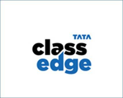
dCell creates the logo for Tata ClassEdge

Commenting on the brief given to dCell, Rajesh Sethia, Head- Sales and Marketing, TIS, said - "Since Tata Interactive Systems, a pioneer and global leader in e-Learning Solutions and simulations, was branching out to provide integrated learning solutions for schools in India, we wanted our logo to exhibit our strengths of authority, expertise and knowledge. We wanted to communicate our ability to deliver a high quality, active learning environment which helped bring out the best from both the teachers as well as the students."
Drawing from this, says Arun Ahuja, VP at dCell, "we developed a logo design that represented TIS's strength and expertise and also conveyed the child friendly learning environment as against a very serious, rigid system".
The rounded typeface conveys warmth and friendliness representing an environment conducive to learning and education. The bold character of the identity lends authority and strength associated with Tata ClassEdge which is responsible for a child's progress.
The treatment between the alphabets "a' and "d' creates a very distinct identity and cues the objective of "edge over others'. Colour blue from the TATA Group Composite Mark lends professionalism and trust. The black typeface adds further to the authority and strength, making a very impactful identity.
Rajesh Sethia continued, "We were happy to partner with dCell who have helped us develop a logo that has delivered on all our design parameters and values we needed to communicate".


Share
Facebook
YouTube
Tweet
Twitter
LinkedIn