Honasa Consumer Reimagines Its Corporate Identity
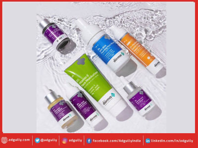
Honasa Consumer Ltd., holding company of Mamaearth, The Derma Co., Aqualogica, and a fast-growing House of Brands for personal care, is thrilled to share that they have reimagined their corporate identity. Over the last 7 years, Honasa Consumer has evolved into a house of brands with a diverse set of offerings ranging from natural, toxin-free proposition to active ingredients, to fruit & actives. The reimagined identity depicts evolution and growth, while re-emphasizing the strong foundation.
The redefined corporate identity has three elements- a female figure, the tree of life, and the multihued circles. The female figure stands for a nurturing mother and also, the heart & start of the organization with Mamaearth. The tree of life denotes growth, balance, and prosperity. Lastly, the multi-hued circles represent the fruits of labor and the diverse brand portfolio.
The logo is a simple yet impactful representation of Honasa and its values our values of Agility, Clarity, and Progressiveness.
Commenting on the renewed identity Varun Alagh, Co-Founder and CEO, Honasa Consumer Ltd. said,” The change in the corporate identity is not just a visual change, it is a representation of our evolution, along with our commitment to innovation, consumer centricity, balance and growth. Honasa Consumer Ltd. has established itself at the forefront of consumer centric branding and marketing and this change is a step towards a new vigor, but the same values.”
The revised corporate identity will start appearing across the website, and social media profiles immediately; it will gradually be incorporated in the marketing materials, and other communications over the coming weeks.


Share
Facebook
YouTube
Tweet
Twitter
LinkedIn