

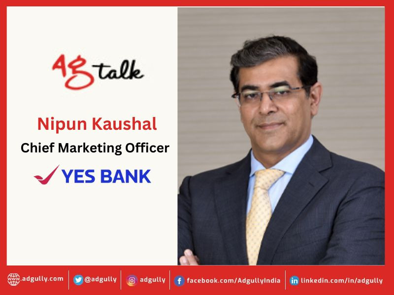
Yes Bank had a rough patch in between, but we are doing very well now: Nipun Kaushal
Yes Bank recently underwent a brand refresh. The bank’s new identity is designed to resonate with the evolving needs and aspirations of customers, while reflecting its intent of going beyond ticking the boxes and enabling people to live each day to the fullest. The narrative echoes the values of Yes Bank that resonate with the bank’s commitment to empower customers to focus on their priorities while the bank takes care of their financial needs.
In conversation with Adgully, Nipun Kaushal, CMO, Yes Bank, speaks about the core idea behind the brand refresh, what the new brand identity signifies, marketing and campaign strategies, and more.
What is the core thought behind Yes Bank’s new brand identity?
We have refreshed ourselves rather than a mere revamp. When I say refresh, we are still the old loved Yes Bank. We did have a rough patch in between, but we are doing very well now. A lot of our old customers have come back. So, we thought of refreshing everything that we are doing. The new Yes Bank is now operational. We had the approach of not only changing the design language, but also the narrative. That’s the genesis of refreshing our logo, where we have retained our tick mark, but in a different format of a soaring bird, and fonts, which are digitally friendly and softer. It also has much more vibrant and digital friendly colours within the family of blue and red. On the design side, if you look at the logo, the alphabets are pretty soft, they are not very edgy.
We have changed the narrative with our new campaign – ‘Life Ko Banao Rich’ – which is currently ongoing. It really resonates with the values with which the bank works, where the consumer needs to fulfill his dreams by doing what he loves and leave the banking to us.
The bank’s narrative mentions going “beyond ticking the boxes” and enabling customers to live each day to the fullest. How does the new brand identity align with this vision?
Earlier, if you remember, you would have to fill out a lot of forms where you had to tick on several boxes. That’s old school. In keeping with today’s times, where Yes Bank is a forward-looking digital bank, having the largest market share in UPI, we said that we are going to move beyond ticking the boxes. If you look at our logo, in the previous logo that tick was within the box, in the new logo, we have moved it out of the box and made it into the form of a soaring bird, which is more fluid and more friendly.
Rebranding is a significant undertaking for any organisation. How do you plan to communicate the changes to your existing customers and potential clients to ensure a smooth transition?
It is already in process as we speak. We have got a very positive and overwhelming response not only from our customers, but our other stakeholders. As a bank, we have the largest base of shareholders as well. Our partners have been supporting us. There has been a lot of communication that has gone to our existing customers through the digital medium. We are running a 360-degree campaign. We have more than 1,200 branches, which are our touch points, where the customers can experience the change. More importantly, we have also ensured that our employees know exactly what has happened, because they are also our brand ambassadors. Thus, we have put in a lot of effort and energy, and our employees are super excited about it. As a result, we really don’t need to spend too many dollars in advertising about it. Our employees themselves are taking it forward, and our customers are pretty happy with that.


Share
Facebook
YouTube
Tweet
Twitter
LinkedIn