Healthfab Partners with Almond Branding to Transform Its Visual Identity
Healthfab, the pioneering company founded in 2019 by Sourav Chakrabarty, Kiriti Acharjee, and Satyajit Chkaraborty to provide comfortable and hassle-free solutions to menstruating women, has undergone a remarkable transformation with the strategic expertise of Almond Branding. The revamp encompasses a fresh visual identity, standardized communication strategy, and an ambitious global expansion plan.
Healthfab initially set out to make the lives of working women in their families easier by creating a stand-alone reusable period panty, the GoPadFree. The product addressed the challenge faced by women who found it difficult to work during their periods due to the lack of a suitable place to change and dispose of old pads. After rigorous testing and feedback incorporation, GoPadFree became the first and only leak-proof reusable standalone period panty in India, garnering significant success both domestically and internationally.
Co-founder of Healthfab, Sourav Chakrabarty, expressed, "Our mission at Healthfab has always been to provide cost-effective and comfortable solutions to women of all backgrounds, challenging preconceptions while promoting innovation in health and hygiene through eco-friendly and sustainable methods. The collaboration with Almond Branding has been instrumental in amplifying our vision and taking Healthfab to newer heights."
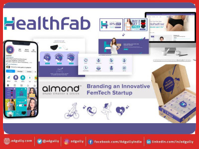
Almond Branding, known for its expertise in startup branding, played a pivotal role in reshaping Healthfab's visual identity. Initially focusing on revamping the logo, the collaboration soon evolved into creating a comprehensive Visual Identity System that harmonizes all aspects of communication, from product packaging to the website and social media.
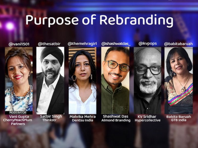
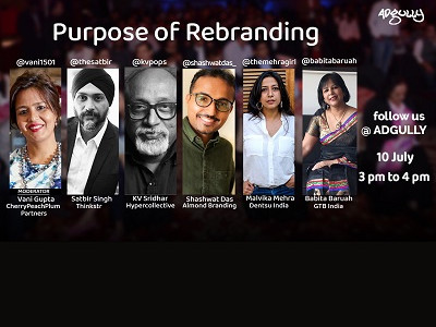
Founder of Almond Branding, Shashwat Das shared, "At Almond Branding, we believe that a visual identity transcends a logo alone. It's a triumph when a brand can be recognized even without displaying its logo. We take pride in developing such Design Language for our clients, ensuring consistency in all forms of communication."
The result is a refreshed logo that embodies Healthfab's core values of Comfort, Care, and Sustainability, inspired by a comforting hug that symbolizes the nurturing experience the brand offers. The captivating colour scheme of turquoise and purple portrays a refreshing, modern, innovative, caring, and trustworthy brand. The newly introduced iconography style reflects care, comfort, affection, and the joy of life, while an illustrative format conveys product details effortlessly.
Additionally, Healthfab's commitment to sustainability is evident in the retention of the brown outer packaging box, symbolizing the brand's mission to eliminate disposable period products and promote eco-friendly practices. By using minimal colours yet dynamic visual elements, even the brown box was transformed into an object of delight.
Almond has also revamped Healthfab's Shopify-based website design, transforming it into an information hub for this niche category. The comprehensive revamp has successfully unified all aspects of Healthfab's brand, resulting in increased website traffic and heightened brand awareness. With the brand infused with renewed energy and vigour, Healthfab is poised for significant expansion in key markets such as India, Middle East, USA, Europe, and Australia.
Join Healthfab on this transformative journey and experience the comfort, care, and sustainability they offer with their innovative and eco-friendly products.









Share
Facebook
YouTube
Tweet
Twitter
LinkedIn